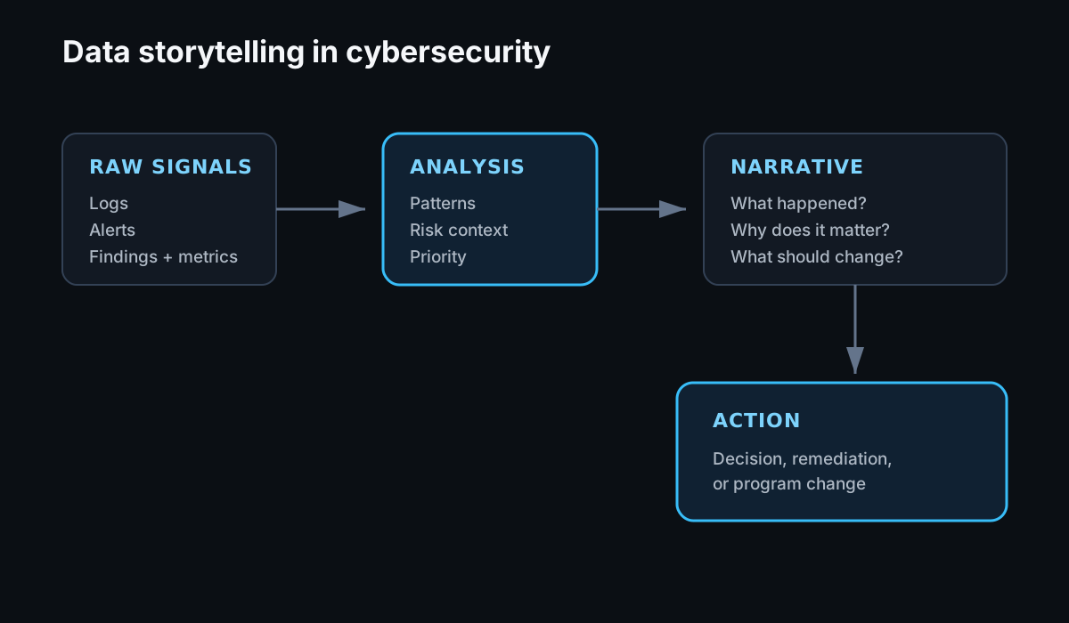
In cybersecurity, data is what helps us understand threats, vulnerabilities, and whether our security controls are actually doing what we expect.
The challenge is that we deal with a lot of it. Logs, alerts, vulnerability findings, access data, authentication events, and security metrics can quickly become noise if we do not have a clear way to explain what they mean.
That is where data storytelling becomes useful.
What is Data Storytelling?
Data storytelling is the process of taking raw data and turning it into a narrative that people can understand and act on.
For me, it is not just about presenting numbers or building a dashboard. The important part is explaining what the data is telling us, why it matters, and what someone should do with that information.
In cybersecurity, this could mean explaining:
- What happened during a security incident
- Whether a security control is working as expected
- Where risk is increasing
- Which vulnerabilities need attention first
- How an IAM or security program is changing over time
The same dataset may need to be explained differently depending on who is looking at it.
An engineer may want the underlying events and technical details. A leader may need to understand the impact, trend, and decision that needs to be made.
The Power of a Good Story
A good story makes complicated security information easier to understand.
For example, I could present a penetration-test report as a list of vulnerabilities and severity ratings. That may be useful to the engineers working through the findings, but it does not necessarily help someone outside the security team understand the overall risk.
Instead, I can explain how an attacker could use those vulnerabilities together to reach sensitive data or another high-value resource.
The underlying findings have not changed. What changes is the context around them.
That context helps people understand why the issue matters and can make it easier to prioritize the work needed to address it.
This applies to more than vulnerability management.
If I am presenting IAM data, for example, a chart showing the number of inactive accounts is useful. It becomes more meaningful when I can explain where those accounts exist, whether they still have access to sensitive applications, why they were not removed, and what process needs to change.
The data gives me the evidence. The story connects that evidence to a decision.
Action Items for Implementing Data Storytelling in Cybersecurity
Understand Your Audience
Before building the chart, dashboard, or presentation, I try to understand who I am speaking to.
What do they care about? What decisions can they make? What action am I asking them to take?
The amount of technical detail I include should depend on the audience rather than how much data I happen to have available.
Use Visuals Where They Help
Graphs, charts, and diagrams can make patterns easier to see and complicated relationships easier to explain.
I do not think every dataset needs a visualization, though. Sometimes a number and a clear explanation are enough.
The visual should make the story easier to understand, not become the story itself.
Focus on the Bigger Picture
It is easy to get lost in individual alerts, vulnerabilities, or events.
I try to step back and ask what the data says about the broader problem.
Is risk increasing or decreasing? Is a process consistently failing? Is one part of the environment creating most of the noise? Is a control actually changing behaviour?
Those questions are usually more useful than simply reporting another count.
Make It Actionable
A security story should lead somewhere.
If I am showing that a control is not working, what should change?
If I am showing that risk is increasing, what decision needs to be made?
If I am presenting a trend, what should someone watch next?
Without that connection to an action or decision, the data may be interesting but not particularly useful.
Use AI and Machine Learning Carefully
AI and machine learning can help when working with large amounts of security data, particularly when looking for patterns, anomalies, or relationships that are difficult to identify manually.
I see them as another tool for helping make sense of the data rather than a replacement for understanding the environment.
The output still needs context. A model may identify an unusual pattern, but someone still needs to determine whether that pattern matters, what caused it, and what action should follow.
Final Take
Data storytelling is something I want to get better at because security work is not only about finding problems. We also need to be able to explain those problems clearly enough that people can make good decisions about them.
The amount of security data we collect will continue to grow. The challenge is making sure that data helps us understand what is happening instead of creating more noise.
For me, that means focusing on the story behind the data: what happened, why it matters, and what we should do next.
In future posts, I plan to dig further into some of the techniques and tools I use to make security data easier to understand and communicate.
Thanks for reading.